Discover the Perfect Sand Color Palette for a Serene and Elegant Space Design
Introduction to Discover the Perfect Sand Color Palette for a Serene and Elegant Space Design
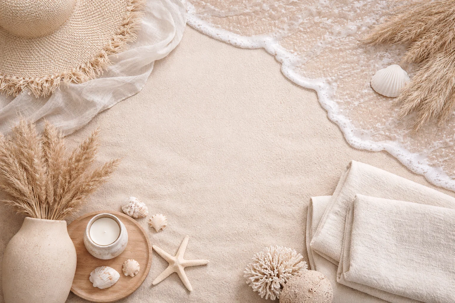
Imagine a space that feels like a gentle exhale—calm, collected, and effortlessly sophisticated. This is the transformative power of designing with a sand color palette. More than just a single shade, this palette encompasses the entire spectrum of nature’s most serene neutral: from the soft, warm beige of sun-bleached dunes to the cool, grey-tinged taupe of wet shoreline. Consequently, it creates a foundation that is both timeless and deeply comforting. Unlike stark whites or bold accent walls, an earthy, neutral scheme built around these hues promotes a sense of visual harmony and spaciousness. It acts as a perfect canvas, allowing textures, natural light, and meaningful decor to take center stage. Whether you’re a homeowner seeking a permanent sanctuary, a renter looking for a reversible refresh, or a design enthusiast craving a minimalist yet warm aesthetic, embracing these sandy tones is a profoundly effective strategy. Ultimately, this approach to design isn’t about following a fleeting trend; it’s about crafting a personal haven that feels grounded, elegant, and perpetually peaceful.
Why Choose a Sand Color Palette for Your Space
Selecting a sand-inspired color scheme for your home is a decision that pays dividends in comfort, aesthetics, and versatility. Firstly, its primary strength lies in its unparalleled ability to cultivate serenity. These hues are inherently calming, reducing visual noise and mental clutter to create a restorative backdrop for daily life. This makes a room painted in sandy beige or greige an ideal retreat from the overstimulation of the modern world.
Furthermore, this palette is a master of visual harmony and light manipulation. Lighter sandy tones reflect natural light beautifully, making rooms feel more airy and expansive—a boon for smaller spaces or apartments with limited windows. Conversely, deeper, richer sand colors add cozy depth and intimacy to larger rooms without feeling heavy or dark. This chameleon-like quality ensures a cohesive flow from room to room, establishing a unified and intentional feel throughout your home.
From a practical standpoint, the neutrality of a beige and taupe color scheme is its greatest asset. It provides the ultimate flexible foundation. Are you drawn to coastal vibes, minimalist modernism, or organic rustic styles? A sand base accommodates them all seamlessly. You can introduce color through easily changeable elements like throw pillows, art, and ceramics. Similarly, it allows the beauty of natural materials—the grain of oak, the weave of linen, the veining of stone—to shine without competition. For budget-conscious decorators or those who love to evolve their style, this means your core investment in walls and large furniture remains perpetually relevant, while smaller accents can be swapped with the seasons or your whims.
Key Elements & Design Components
Essential Decor Items for a Sand Color Palette
To bring this serene vision to life, focus on elements that enhance texture, natural warmth, and organic simplicity.
- The Foundation: Paint & Wall Coverings: Begin with your walls. Opt for matte or eggshell finishes in colors like soft beige, warm greige, or pale oatmeal. For added depth, consider a limewash or clay plaster finish, which introduces beautiful, subtle variation reminiscent of natural stone.
- Furniture with Organic Character: Choose pieces in light or medium-toned woods (oak, ash, maple), bleached rattan, or linen-upholstered frames. Look for clean, soft-lined silhouettes that avoid feeling too rustic or too coldly modern. A plush, neutral sofa in a sand-colored fabric is a worthy investment.
- Textural Textiles: This is where the palette comes alive. Layer different weights and weaves: nubby wool throws, smooth cotton curtains, chunky knit pillows, and silky-soft linen bedding. Stick to the tonal spectrum—cream, ivory, taupe, brown—to build richness without introducing contrast.
- Natural Fiber Flooring & Rugs: Jute, sisal, seagrass, or wool rugs in natural hues are perfect. They add crucial texture and anchor the space. Similarly, light wood floors or neutral large-format tiles complement the scheme beautifully.
- Accessories & Lighting: Decorate with objects found in nature: dried grasses, smooth stones, untreated wood bowls, and terracotta pottery. Lighting should be warm and soft; think paper lanterns, woven pendants, or ceramic table lamps with linen shades. Metallics should be understated—brushed brass, aged bronze, or unlacquered brass work well.
Style Variations & Budget-Friendly Alternatives
The beauty of this neutral earth tone design is its adaptability. For a coastal twist, add accents in watery blues and greens, and incorporate more driftwood and shell elements. For a modern edge, pair the sandy walls with black metal accents, sleek marble, and geometric forms.
On a budget? There are countless savvy swaps. Instead of repainting, use large, sand-colored area rugs and curtains to influence the room’s color temperature. Removable peel-and-stick wallpaper in a grasscloth or textured pattern can add instant depth to a rental. Update cabinet hardware or light fixtures rather than replacing whole pieces. Shop second-hand for solid wood furniture and sand it down to a lighter finish. Finally, DIY art using natural pigments on canvas or framing beautiful pieces of handmade paper can create high-impact, personal decor for very little cost.
How to Achieve the Look: Step-by-Step Styling Guide
Follow this actionable guide to methodically build your serene sanctuary.
Step 1: Define Your Sand Spectrum
Start by gathering physical paint samples and fabric swatches in your chosen sand color palette. Hold them against your floor and in different lights throughout the day. Decide if you’re leaning toward the warmer (beige, camel) or cooler (greige, taupe) side of the spectrum. Choose one primary wall color, a slightly lighter or darker shade for trim, and an accent tone for a feature piece of furniture. This creates a tonal, monochromatic base that is far from flat.
Step 2: Establish the Spatial Layout
Before bringing in furniture, consider the room’s flow and function. In a living room, orient seating to encourage conversation and perhaps face a focal point like a window or fireplace. Use a large, natural fiber rug to define the area. In a bedroom, ensure the bed is anchored and has clear walking space. The goal is to create a layout that feels intuitive and peaceful, avoiding clutter and blocked pathways.
Step 3: Layer in Textural Depth
This is the most crucial step for avoiding a bland look. Begin with your largest textile—the curtains or rug. Then, add your upholstered furniture. Finally, layer on the details: a wool throw draped over the sofa, a mix of linen and velvet pillows, a knitted pouf. Each addition should bring a new, tactile quality. Remember, within a tonal beige scheme, texture is your primary source of visual interest.
Step 4: Incorporate Natural and Organic Accents
Introduce elements that connect the space to the outdoors. Place a potted olive tree or a vase of pampas grass in a corner. Style shelves with collections of stones, fossilized wood, or simple ceramic vases. Choose art with organic shapes, landscapes, or abstract pieces in earthy pigments. These elements inject soul and a sense of calm authenticity.
Step 5: Illuminate with Warm, Layered Light
Overhead lighting alone can feel harsh. Implement a three-layer lighting strategy: ambient (overhead or recessed), task (floor lamps by reading chairs, under-cabinet lights), and accent (picture lights, small table lamps). Use warm-white bulbs (2700K-3000K) and choose fixtures made from natural materials like paper, rattan, or linen to diffuse a soft, inviting glow that enhances the sandy hues.
Elevating the Look: Advanced Styling Tips
To truly perfect your serene interior design, focus on these refined details. Firstly, play with scale and form. Introduce one or two sculptural pieces—an organic-shaped floor lamp, a curved sofa, or a large, abstract painting—to break up the horizontal lines and add dynamic energy. Secondly, consider the “third texture” in your metals and hardware. Instead of polished chrome, opt for finishes with patina and variation, such as blackened steel or fluted brass, which feel more tactile and artisanal.
Additionally, don’t shy away from all moments of contrast. A single piece in a deep charcoal, black, or even a muted forest green can provide a stunning anchor that makes the surrounding sandy tones feel even softer and more luminous. Finally, engage all the senses. A subtle, wood-based diffuser scent, a soft wool blanket to touch, and the inherent acoustic softening of textiles and rugs will make the space feel not just beautiful, but holistically nurturing.
Maintenance & Care: Keeping Your Space Fresh
A space defined by light colors and natural materials requires thoughtful care to stay pristine. For walls painted in a sand color palette, use a matte finish paint with washability for easy spot-cleaning of marks. Regularly dust natural fiber rugs (like jute or sisal) with a stiff brush and attend to spills immediately to prevent staining; consider a fabric protector spray upon purchase.
Linen and cotton textiles can often be machine-washed on gentle cycles; air-drying helps maintain their texture and prevent shrinkage. For wool throws, follow specific care labels, typically calling for dry cleaning or hand-washing. To keep the look feeling current, implement seasonal “refreshes”: swap lighter linen pillows for heavier wool knits in winter, or change out accessory colors (e.g., from sage green to sky blue) to reflect the time of year. This approach maintains the core serene elegance while allowing for playful, low-commitment updates.
FAQs: Frequently Asked Questions About a Sand Color Palette
Q: Won’t a sand color palette make my room look boring or bland?
A: Not at all! The key is embracing tonal variation and, most importantly, texture. By layering different materials—smooth linen, nubby wool, rough sisal, polished wood—you create immense visual interest. The palette acts as a calm backdrop that lets these textures and forms shine, resulting in a rich, sophisticated space that is far from flat.
Q: Can I use a sand color scheme in a room with very little natural light?
A: Absolutely. In fact, it can be a great strategy. Choose a sand hue with a slightly warmer undertone (a creamy beige rather than a grey-taupe) to counteract cool, shadowy light. Then, compensate with ample, warm artificial lighting (layer those lamps!) and strategically placed mirrors to reflect light around the room.
Q: What accent colors work best with sandy beige walls?
A: A sand color palette is incredibly versatile. For a harmonious look, stick to earthy accents: sage green, terracotta, ochre, or deep brown. For a refreshing contrast, muted blues (like slate or navy) or soft greens (like eucalyptus) work beautifully. Even small pops of black can add striking definition.
Q: Is this style child- or pet-friendly?
A: Yes, with smart choices. Opt for performance fabrics on upholstery that are stain-resistant and easy to clean. Choose durable, washable rugs (like indoor-outdoor options in natural looks) over delicate sisal. Use washable paint on walls and consider leather or faux leather on dining chairs, which are easy to wipe down. The neutral palette is also great at hiding the occasional bit of lint or fur between vacuuming.
Q: How do I incorporate pattern without breaking the serene feel?
A: Introduce pattern in a tonal way. Think a textured, woven throw with a subtle geometric weave, curtains with a faint stripe in a slightly darker shade of sand, or pillows with an organic, abstract pattern in cream and taupe. The pattern should feel like a natural extension of the color story, not a separate, competing element.