Color is much more than a simple visual experience. It is a language of emotion, a tool for branding, and a fundamental element of interior design that can completely shift the energy of a room. When you look at a curated palette like the one featuring Pink Mist, Bubblegum, Cherry Soda, and Ruby Petals, you are looking at a roadmap for creating a specific atmosphere. This collection of tones celebrates the versatility of pink, moving from the ethereal and light to the deep and sophisticated. Whether you are a graphic designer, a homeowner looking for a fresh coat of paint, or a digital creator, understanding how to layer these specific shades can elevate your work from ordinary to intentional.
The Psychology and Power of Pink in Modern Design
For a long time, pink was pigeonholed into very narrow categories. However, in recent years, it has undergone a massive rebranding. Designers now recognize pink as a powerhouse of versatility. Light pinks like Pink Mist offer a sense of calm and clarity, often used in minimalist spaces to provide a hint of warmth without the heaviness of beige or grey. As we move into the mid-tones like Bubblegum and Cherry Soda, the energy shifts toward playfulness, nostalgia, and vibrancy. These colors are excellent for grabbing attention and evoking a sense of joy.
Finally, we have the deeper, more grounded shades like Ruby Petals. These tones bring in a level of sophistication and mystery. They bridge the gap between classic romanticism and modern edge. By using a monochromatic pink palette, you create a cohesive visual story that feels harmonious rather than chaotic. This approach allows the eye to travel across different saturations of the same hue, providing depth and interest while maintaining a professional and polished look.
Breaking Down the Palette: From Mist to Ruby
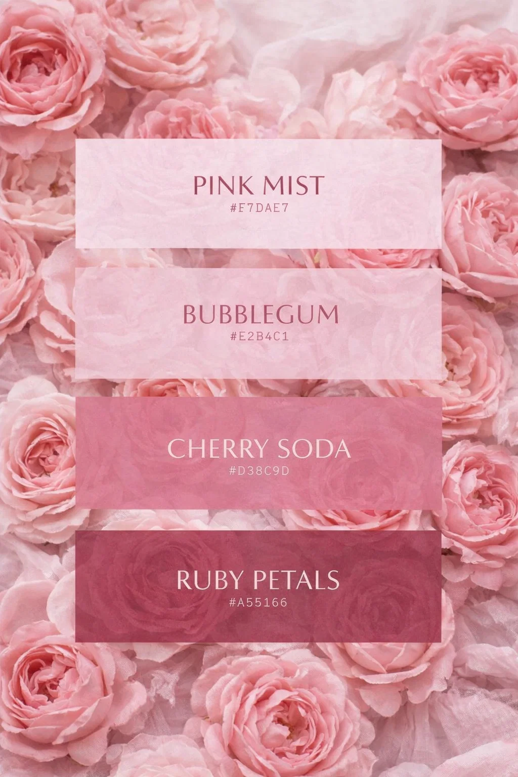
To truly master this palette, we need to look at each individual shade and understand its unique role in a design project. Each hex code provided in the image represents a specific personality within the pink family.
Pink Mist (#F7DAE7)
Pink Mist is the foundation of this collection. It is a barely there shade that serves as an excellent alternative to stark white. In interior design, this is a “breath of fresh air” color. It works beautifully on large surfaces like walls or as the primary background for a website. Because it has a cool undertone, it feels crisp and modern. It pairs exceptionally well with natural textures like light wood, linen, and wicker, which makes it a staple for anyone leaning into a boho or minimalist aesthetic.
Bubblegum (#E2B4C1)
Moving one step deeper, we find Bubblegum. This shade is the epitome of the classic pink aesthetic but with a slightly muted, dusty quality that keeps it from being overwhelming. It is the perfect “pop” color. If you are designing social media graphics or a brand logo, Bubblegum provides enough contrast against lighter backgrounds to be readable while remaining soft enough to feel approachable. It evokes a sense of youthfulness and creativity, making it a favorite for lifestyle bloggers and creative entrepreneurs.
Cherry Soda (#D38C9D)
Cherry Soda introduces a bit more “weight” to the palette. It is a medium-toned rose that starts to lean into the more romantic and vintage side of the spectrum. This color is highly effective in home textiles, such as velvet pillows or throw blankets. It creates a focal point without the aggression of a bright red. In branding, Cherry Soda suggests reliability and warmth. It is a grounded color that feels established and sophisticated, making it ideal for brands that want to appear high-end yet welcoming.
Ruby Petals (#A55166)
The anchor of the entire palette is Ruby Petals. This deep, wine-infused pink is where the real drama happens. Using a dark shade like this provides the necessary contrast to make the lighter colors in the palette truly shine. It is a sophisticated choice for cabinetry, accent walls, or professional stationary. When used sparingly, Ruby Petals adds a touch of luxury. When used as a dominant color, it creates a cozy, moody environment that feels intimate and high-fashion.
Implementing the Pink Palette in Home Decor
Transforming a living space using these colors requires a balance of texture and light. You do not want a room to feel “flat.” Instead, you want to use the gradient to your advantage to create layers. Imagine a room with Pink Mist walls. The light reflects off the pale surface, making the room feel larger. Now, introduce a sofa in a Cherry Soda fabric. The contrast is immediate but soft. To ground the room, you might add a rug or curtains in Ruby Petals, which pulls the eye downward and creates a sense of stability.
- Kitchen and Dining: Consider Ruby Petals for a kitchen island or a set of velvet dining chairs. It pairs beautifully with gold hardware and white marble countertops.
- The Bedroom: Use Pink Mist for your bedding and Bubblegum for accent pillows. This combination promotes rest and relaxation while still feeling stylish.
- Small Spaces: In a small bathroom or office, stick to the lighter end of the palette with Pink Mist and Bubblegum to keep the area feeling open and bright.
Color Theory for Branding and Digital Content
If you are a content creator or a business owner, your visual identity is your first impression. This pink palette is particularly effective for niches like wellness, beauty, lifestyle, and creative services. The key to successful branding with these colors is the 60-30-10 rule. This means 60 percent of your brand visuals should be a primary neutral (like Pink Mist), 30 percent should be a secondary color (like Cherry Soda), and 10 percent should be an accent (like Ruby Petals).
Using these specific hex codes ensures consistency across your website, Instagram feed, and physical products. Consistency builds trust. When a follower sees these specific shades of pink, they should immediately associate them with your brand. The transition from the light, airy Pink Mist to the deep Ruby Petals allows you to create a hierarchy of information. Use the darkest shade for your most important call-to-action buttons or headlines, and use the lightest shades for background elements that should not distract from your message.
Natural Pairings and Materials
While this palette is beautiful on its own, it truly comes to life when paired with the right materials and complementary colors. To keep the look modern and avoid it feeling too “sugary,” consider incorporating organic elements. The softness of pink is perfectly balanced by the ruggedness of natural materials.
Metallic Accents
Gold and brass are the natural best friends of this pink palette. The warm undertones of the metal enhance the warmth in Cherry Soda and Ruby Petals. For a more contemporary and cool look, silver or chrome can be paired with Pink Mist to create a sleek, futuristic vibe. If you want a more industrial feel, matte black accents provide a sharp, modern contrast that keeps the pink from feeling too traditional.
Wood and Greenery
Light woods like oak, maple, and birch complement the softer side of this palette, reinforcing a Scandinavian or boho aesthetic. If you prefer a more traditional or rustic look, dark walnut wood creates a stunning backdrop for the deeper Ruby Petals. Additionally, never underestimate the power of plants. The deep green of a Fiddle Leaf Fig or a Monstera provides a complementary color contrast to pink, making both the plant and the decor look more vibrant.
DIY Tips for Using Hex Codes
One of the best things about having specific hex codes is the precision they offer. You no longer have to guess which paint swatch matches your digital mood board. Most major paint brands now allow you to bring in a digital sample or a hex code to get a custom mix that is nearly identical to your screen. This allows for a seamless transition between your digital planning and your physical reality.
For digital creators, these codes can be plugged directly into tools like Canva, Photoshop, or Procreate. By saving these as a “brand kit,” you can ensure that every graphic you produce stays within this specific color story. This is the secret to those perfectly aesthetic Pinterest boards and Instagram grids that seem so effortlessly put together.
Final Thoughts on the Pink Aesthetic
Embracing a monochromatic palette like this one is about leaning into a specific mood and owning it. Pink is a color of compassion, creativity, and strength. By moving through the different saturations shown in the image, you can create a look that is as multifaceted as you are. From the quiet whisper of Pink Mist to the bold statement of Ruby Petals, there is a shade here for every project and every personality.
Whether you are repainting a room, designing a new logo, or just looking for some creative inspiration, let these tones guide you. Experiment with the ways they interact with light, texture, and other colors. You will likely find that pink is far more flexible and sophisticated than you ever imagined. Start small with a few accents and watch how these colors transform your environment and your digital presence into something truly beautiful and cohesive.