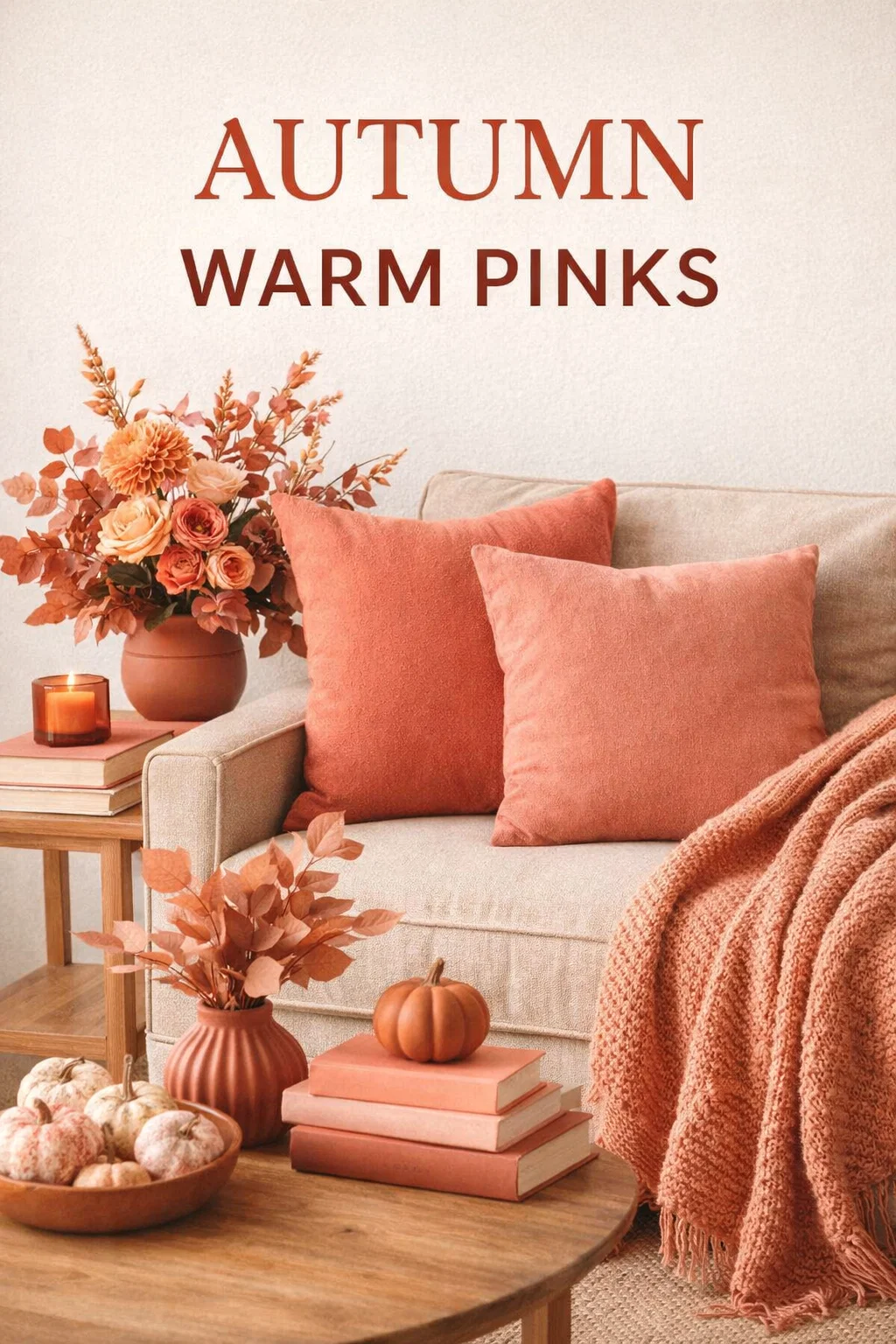
Navigating the world of color theory can often feel like wandering through an endless maze of shades and tints. However, every so often, a specific seasonal palette emerges that perfectly captures a sense of warmth, elegance, and approachability. The image of the Autumn Warm Pinks palette serves as a masterclass in how subtle shifts in undertone can transform a standard color into a specialized tool for design and personal styling. These colors are not just pinks; they are sophisticated blends of coral, peach, and terracotta that resonate with the earthy energy of the autumn season. Whether you are looking to refresh your wardrobe, rebrand your business, or repaint a room in your home, understanding the depth of these warm pinks is the first step toward a cohesive and inviting aesthetic.
The Magic of Seasonal Color Analysis
Seasonal color analysis is a transformative tool used by stylists and designers to categorize colors based on their harmony with natural human features or environmental settings. The Autumn category is traditionally defined by rich, earthy, and muted tones. While many people immediately think of burnt oranges and deep browns when they hear the word autumn, the inclusion of warm pinks adds a necessary layer of softness and versatility.
The pinks featured in this specific palette are carefully curated to ensure they do not clash with the golden undertones typical of the autumn season. By leaning into oranges and yellows as a base, these pinks become approachable and comforting. They lack the icy, blue-based sharpness of winter berries or the neon intensity of summer fuchsias. Instead, they offer a glow that feels organic and timeless.
Deconstructing the Palette: Four Essential Shades
To truly appreciate the utility of this color collection, we must look at the specific characteristics of each individual shade. Each one carries a different psychological weight and serves a unique purpose in a visual composition.
Coral Pink: The Vibrant Connector
Coral Pink is the most energetic member of this group. It sits comfortably at the intersection of pink and orange, radiating a youthful yet sophisticated energy. In the context of the autumn palette, Coral Pink acts as a bridge. It connects the darker, woodier tones of fall with a sense of brightness. In fashion, a coral pink blouse can brighten a complexion that might otherwise look washed out by heavy browns. In graphic design, it serves as an excellent call to action color because it grabs attention without the aggressive nature of a true red.
Salmon Pink: The Sophisticated Neutral
Salmon Pink is often misunderstood as a simple pastel, but in the autumn warm pinks family, it acts as a soft, sophisticated neutral. It has a slightly more muted quality than coral, making it incredibly easy on the eyes. This is the shade of a sunset reflecting off a desert landscape. Because of its balance, Salmon Pink works beautifully in large-scale applications like interior wall colors or background elements in digital branding. It provides warmth without overwhelming the senses, creating a space that feels both airy and grounded.
Peach Pink: The Delicate Warmth
Peach Pink is the lightest shade in this collection, offering a delicate touch of warmth. It is often associated with health and vitality. This color is a favorite in the beauty industry because it mimics a natural, healthy flush on the skin. When used in home decor, Peach Pink can make a small room feel larger while maintaining a cozy atmosphere. It is the color of soft morning light and brings a sense of optimism to any project it is included in.
Terracotta Rose: The Earthy Anchor
Terracotta Rose is the deepest and most grounded shade in the group. It is heavily influenced by the clay-like tones of the earth, which gives it a rustic and artisanal feel. This color is where the pink family meets the traditional autumn browns and reds. It is a powerful choice for furniture, heavy knitwear, or professional branding that wants to convey stability and tradition. Terracotta Rose provides the “weight” needed to balance out the lighter peach and salmon tones, ensuring the palette feels complete.
Integrating Warm Pinks into Interior Design
If you are considering a home renovation or a simple room refresh, the Autumn Warm Pinks palette offers a refreshing alternative to the gray and beige trends that have dominated the last decade. These colors provide a “new neutral” that feels personalized and intentional.
Consider using Terracotta Rose for an accent wall in a dining room. It creates a rich, intimate backdrop that encourages long conversations over dinner. You can then layer in Salmon Pink textiles, such as linen curtains or throw pillows, to soften the space. The result is a room that feels curated and layered rather than flat. For bathrooms or kitchens, Peach Pink tiles or accessories can introduce a clean, fresh feeling that still feels connected to the rest of a warm-toned home.
- Contrast with Wood: These pinks look stunning when paired with natural wood elements like oak, walnut, or teak.
- Metallic Accents: Gold and brass hardware enhance the warm undertones of these pinks, creating a luxurious finish.
- Textural Variety: Use these colors in different textures like velvet, wool, and ceramic to show off their depth.
Fashion and Personal Branding with Autumn Pinks
From a wardrobe perspective, the Autumn Warm Pinks palette is a secret weapon for those with warm skin undertones. While cool-toned pinks can sometimes make warm complexions look sallow, these peach and coral-based shades do the exact opposite. They harmonize with the skin’s natural warmth, making the wearer look vibrant and well-rested.
For professional branding, these colors convey a specific set of values. They are seen as approachable, creative, and nurturing. A brand that utilizes Salmon Pink and Terracotta Rose often feels more “human” and less corporate. This makes the palette ideal for lifestyle bloggers, wellness coaches, and artisanal businesses. It is a color story that tells the audience you are grounded in reality but still appreciate beauty and softness.
The Psychology of Warm Pinks
Colors have a profound impact on our moods and perceptions. The psychology behind warm pinks is one of comfort and emotional security. Unlike the high-energy of bright red or the calm detachment of blue, warm pinks invite us to relax. They are often associated with the concept of “home” and “nurturing.”
By using these shades in your daily life, you are essentially creating an environment that supports emotional well-being. Terracotta Rose feels protective and strong, while Peach Pink feels light and hopeful. Together, they create a balanced emotional landscape. This is why these colors are so popular in spaces meant for relaxation, such as bedrooms and reading nooks.
Why Undertones Matter
The reason this specific image is so helpful is that it highlights the importance of undertones. A common mistake people make is choosing a “pink” without looking at its base. If you mix a cool, blue-based pink with a warm, orange-based autumn palette, the result will feel jarring. This guide helps viewers see exactly where the “warmth” comes from. By keeping the undertone consistent across Coral, Salmon, Peach, and Terracotta, you ensure visual harmony regardless of how you mix and match the shades.
Practical Tips for Combining These Colors
You do not have to use all four colors at once to see the benefits of this palette. In fact, using them in pairs can be even more effective. Try combining Coral Pink with Terracotta Rose for a high-contrast, energetic look. Alternatively, pair Salmon Pink with Peach Pink for a monochromatic, soothing effect that is perfect for minimalist designs.
When working with these colors, remember to consider the lighting. Warm pinks will look much richer under soft, yellow light bulbs or during the “golden hour” of natural sunlight. In cool, fluorescent lighting, they may lose some of their magic. Always test your paint swatches or fabric samples in the environment where they will live to see how the light interacts with the pigments.
Conclusion: Embracing the Warmth of Autumn
The Autumn Warm Pinks palette is a testament to the versatility and beauty of warm-toned colors. By moving away from the traditional constraints of what autumn “should” look like, we open the door to a world of coral, salmon, and terracotta hues that bring life and light to every corner of our world. These colors are more than just a trend; they are a timeless choice for anyone who values warmth, comfort, and sophisticated style. Whether you are painting a canvas, styling an outfit, or designing a brand, let these warm pinks be your guide to a more harmonious and beautiful aesthetic. They remind us that even in the cooling months of autumn, there is plenty of warmth to be found if we only know where to look.