There is something undeniably timeless about the marriage of soft pinks and botanical greens. When you look at a palette featuring shades like Blush, Antique Rose, and Dried Thyme, you are not just looking at colors; you are looking at a mood. This specific combination evokes a sense of vintage romance, organic beauty, and a sophisticated calm that works across almost every design medium. Whether you are a bride-to-be planning a secret garden wedding, a homeowner looking to soften a bedroom, or a digital creator building a brand that feels approachable yet high-end, this color story offers a masterclass in balance.
The Psychology of Romantic Neutrals
Colors speak a silent language that dictates how we feel the moment we enter a room or land on a website. The core of this palette lies in its ability to feel nostalgic without feeling dated. Pink, often unfairly pigeonholed as purely feminine, takes on a new life when it is desaturated into tones like Bisque and Antique Rose. These are what designers call “dirty pinks” or “nude roses,” which carry an earthy undertone that makes them feel grounded and mature.
By introducing Dried Thyme, a muted olive green, the palette achieves a natural equilibrium. In nature, we see these colors together constantly. Think of a tea rose sitting against its dusty leaves or a sunset fading over a forest canopy. Because our brains are hardwired to find harmony in the natural world, this combination feels inherently right. It signals safety, comfort, and a touch of luxury that is not loud or demanding.
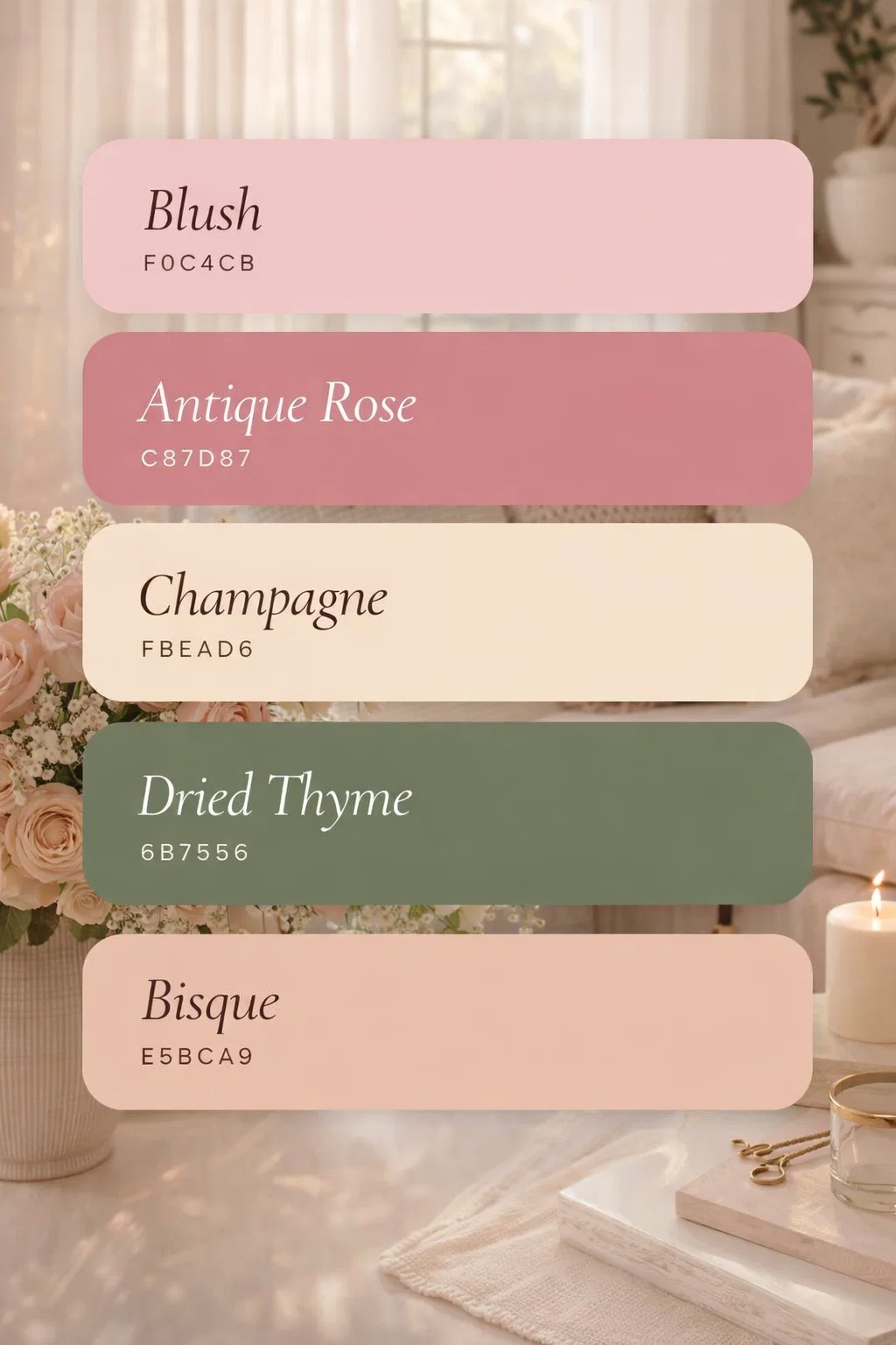
Breaking Down the HEX Codes
To truly understand how to use these colors, we have to look at the individual roles they play in the overall composition. Each shade has a specific “weight” and purpose:
- Blush (F0C4CB): This is your primary light source. It is soft, airy, and serves as a beautiful alternative to stark white or beige.
- Antique Rose (C87D87): The anchor of the pinks. It provides depth and a Victorian-inspired elegance that prevents the palette from looking too youthful.
- Champagne (FBEAD6): This is the ultimate bridge color. It has a slight yellow undertone that adds warmth and glow to the cooler pinks.
- Dried Thyme (6B7556): The essential contrast. Without this green, the palette might feel too “sweet.” The green adds a needed bitterness that makes the pinks pop.
- Bisque (E5BCA9): A peachy-tan hybrid that pulls the floral tones toward a more modern, boho-chic aesthetic.
Transforming Your Living Space with This Palette
Interior design is perhaps the most impactful way to bring these colors to life. Because these tones are muted, they are incredibly forgiving and can be used in large doses without becoming overwhelming. Imagine a living room where the walls are painted in a very pale Bisque. This provides a warm, neutral canvas that feels much more inviting than a standard gray.
For furniture, a velvet sofa in Antique Rose becomes an instant focal point. Velvet catches the light in a way that highlights the different dimensions of rose gold and dusty pink, making the piece feel expensive and curated. To keep the room from feeling too monochromatic, you would introduce the Dried Thyme through large indoor plants like an Olive tree or a Fiddle Leaf Fig, or even through textured throw pillows and wool blankets.
Creating a Serene Bedroom Sanctuary
If there is one room where this palette shines, it is the bedroom. The goal of a bedroom is to lower the heart rate and prepare the mind for rest. The soft, “quiet” nature of Champagne and Blush creates a cocoon-like effect. Layering is key here. Think about linen bedding in a mix of Blush and Bisque, topped with a heavy quilted coverlet in Dried Thyme at the foot of the bed. The mix of textures, combined with the organic color scheme, mimics the feeling of a high-end boutique hotel.
Event Planning and Wedding Aesthetics
In the world of weddings, this color story is currently seeing a massive resurgence. It fits perfectly into the “Cottagecore” or “English Garden” wedding themes that have become so popular. Instead of the bright, bubblegum pinks of the past, modern couples are opting for these “dried floral” tones. They look spectacular in photography, especially during the golden hour when the sun enhances the warm peach and champagne undertones.
Floral Arrangements and Tablescapes
When working with a florist, you can use these HEX codes to ensure your floral vision is cohesive. You aren’t just looking for “pink flowers.” You are looking for Quicksand roses, Café au Lait dahlias, and dried eucalyptus. The inclusion of “dried” elements, such as pampas grass or bleached ruscus, mirrors the Bisque and Champagne tones perfectly. On the tables, a sage green runner (Dried Thyme) provides the perfect backdrop for rose gold cutlery and cream-colored ceramic plates.
Digital Branding and Graphic Design
For entrepreneurs and bloggers, your visual identity is your first impression. If your brand is centered around wellness, organic skincare, or slow living, this palette is a strategic goldmine. It communicates a “soft life” philosophy. In a digital space filled with bright, neon “look at me” colors, a website designed with these muted tones stands out by being a breath of fresh air.
Typography and User Experience
When using these colors for a website, use Champagne as your primary background color instead of white. It is easier on the eyes and gives the site a premium, “paper-like” feel. Use Antique Rose for your call-to-action buttons because it provides enough contrast to be seen without being aggressive. Dried Thyme is excellent for text accents or icons, as it remains highly legible while reinforcing the organic theme of the brand.
Fashion and Personal Style
Bringing this palette into your wardrobe is an easy way to look polished and put-together. These colors are universally flattering because they mimic the natural flush of the skin. A monochromatic outfit using different shades of pink and tan looks incredibly chic and intentional. For example, pairing an Antique Rose silk blouse with Bisque-colored trousers creates a long, elegant silhouette.
Accessories are where you can introduce the Dried Thyme. A sage green handbag or a pair of olive-toned leather boots breaks up the warmth of the pinks and adds an element of “cool” to the outfit. This is a palette that transitions beautifully between seasons. In the spring, the Blush tones feel fresh and floral. In the autumn, the Rose and Thyme tones feel moody and cozy.
The Versatility of Muted Tones
One of the biggest misconceptions in design is that “neutral” only means beige, gray, or white. In reality, any color can act as a neutral if it is sufficiently desaturated. This palette proves that pink and green can be the new neutrals. They offer more personality than a standard gray scale but maintain the same level of versatility. You can easily add a “pop” of a stronger color, like a deep burgundy or a metallic gold, to this palette to change the energy for different occasions.
DIY and Creative Projects
If you are a crafter or a DIY enthusiast, these colors are perfect for handmade projects. If you are painting furniture, using a chalk paint in Dried Thyme and distressing it to show hints of a wood grain underneath creates a beautiful “shabby chic” look. For those into stationery or scrapbooking, mixing these tones with vintage ephemera, like old postcards or tea-stained paper, creates a cohesive and nostalgic aesthetic that is deeply satisfying to look at.
Conclusion: Why This Palette Works
The magic of the “Blush, Antique Rose, and Dried Thyme” palette lies in its sophistication and its roots in the natural world. It avoids the pitfalls of being too trendy by leaning into colors that have been favored by artists and designers for centuries. It balances the “sweet” with the “salty,” the “feminine” with the “earthy,” and the “light” with the “dark.”
Whether you are applying these colors to a physical space, a digital platform, or a personal event, the key is to respect the balance. Let the soft pinks provide the light and the warmth, use the champagne and bisque to bridge the gaps, and never forget the grounding power of a good, dusty green. When you follow this recipe, the result is always the same: a design that feels intentional, harmonious, and timelessly beautiful. Take these HEX codes and start experimenting. You might be surprised at how much life these “muted” colors can bring to your next project.