Creating a space that feels both sophisticated and deeply comforting is an art form. The color palette featured in this inspiration piece represents a shift toward mindful interior design, where the focus is on earthy, grounded tones that evoke a sense of peace. By blending the organic feel of Dried Sage and Warm Oak with the romantic depth of Dusty Rose and Faded Rust, we find a balance that works perfectly for a modern home. This specific combination is often referred to as the new neutral palette because it provides enough color to be interesting while remaining soft enough to act as a backdrop for everyday life.
The Psychology of Earthy Pinks and Muted Greens
Colors have a profound impact on how we feel within our four walls. When we look at a palette consisting of Dried Sage and Dusty Rose, we are seeing a classic complementary relationship that has been softened for a contemporary aesthetic. Sage green is widely recognized for its ability to reduce stress and bring the calming essence of nature indoors. It acts as a bridge between the digital world and the natural world, giving our eyes a place to rest after a long day of screen time.
On the other hand, the pink spectrum used here is far from the bright bubblegum shades of the past. Dusty Rose and Faded Rust carry a certain weight and maturity. These colors are associated with warmth, compassion, and a subtle energy. When you pair these with the grounding elements of Bone and Warm Oak, the result is a room that feels lived in and authentic. This is a palette designed for connection, making it an ideal choice for living rooms where family and friends gather to share stories and relax.
Breaking Down the Five Essential Shades
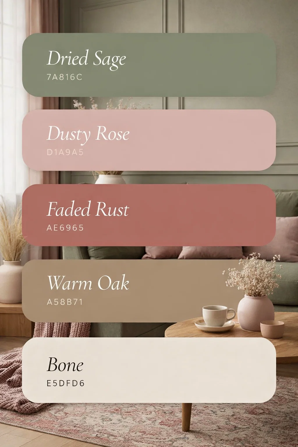
To truly master this look, it helps to understand the role each specific color plays in the overall design. Each hex code provided in the visual serves a purpose in building a cohesive environment.
- Dried Sage (7A816C): This is your foundational organic tone. Use this for larger furniture pieces like a velvet sofa or as an accent wall to bring a botanical vibe to the room.
- Dusty Rose (D1A9A5): This shade provides the softness. It works beautifully in textiles, such as throw pillows, blankets, or even light linen curtains that let the sunlight filter through with a warm glow.
- Faded Rust (AE6965): This is the depth and the soul of the palette. It is a more saturated tone that adds a touch of bohemian flair. It is perfect for rugs, ceramics, or artwork.
- Warm Oak (A58B71): Every room needs a wood element to feel grounded. This tan shade represents the natural textures like jute, rattan, or actual oak furniture that tie the greens and pinks together.
- Bone (E5DFD6): This is your primary neutral. Instead of a stark, cold white, Bone offers a creamy warmth that keeps the space feeling cozy rather than clinical. Use this for your walls, trim, or large area rugs.
How to Incorporate This Palette into Your Living Space
Implementing a new color scheme does not always require a full renovation. You can start small and build up the layers of color over time. The key to making this specific palette work is texture. Because the colors are muted and matte, the variety of materials in the room will prevent the design from looking flat.
Start with the Walls and Windows
For a bright and airy feel, use the shade Bone for your main wall color. It provides a clean canvas that allows the pinks and greens to pop. If you are feeling more adventurous, a Sage Green accent wall behind a sofa or bed can create a stunning focal point. To keep the atmosphere light, choose window treatments in a sheer Dusty Rose. As the light passes through the fabric, it will cast a warm, flattering light across the entire room, making the space feel perpetually bathed in the golden hour.
Layering Textiles for a Cozy Vibe
One of the best ways to use Faded Rust and Dusty Rose is through layering fabrics. Think about a sage green sofa draped with a heavy knit throw in Faded Rust. Add a few pillows in a mix of linen and velvet using the rose and oak tones. This mix of textures creates a tactile experience that invites people to sit down and get comfortable. A vintage style rug that incorporates all these colors can act as the anchor for the entire room, pulling the different elements into one unified design.
The Importance of Natural Materials
This color palette is heavily inspired by nature, so it only makes sense to include natural materials in your decor. Wood is the obvious choice, but the type of wood matters. The Warm Oak shade suggests a medium toned wood with visible grain. Look for coffee tables, shelving, or picture frames that have a matte finish rather than a high gloss. This keeps the look modern and rustic.
Bringing the Outdoors In with Greenery
While Sage Green is a color on the walls or in the fabric, nothing beats the real thing. Adding live plants is a natural extension of this palette. The deep green leaves of a Fiddle Leaf Fig or the silvery tones of a Eucalyptus branch will complement the Dried Sage and Faded Rust beautifully. Plants also add a layer of movement and life to the room that paint alone cannot achieve.
Ceramics and Decorative Accents
Small details often make the biggest impact. Consider a collection of terracotta pots in various states of weathered rust or matte ceramic vases in bone and rose tones. These items can be styled on a mantle or a bookshelf to weave the color story throughout the room. Even the choice of hardware, like brushed brass or antique bronze, can lean into the warmth of the oak and rust tones, adding a touch of luxury to the organic aesthetic.
Why This Style is Perfect for Modern Living
In recent years, there has been a significant move away from the cold, gray interiors that dominated the previous decade. People are craving warmth and a sense of home. This palette of Sage, Rose, and Rust answers that call by providing a sophisticated way to use color. It is a grown up version of a bohemian aesthetic, often called boho chic or organic modernism.
Creating a Mindful Retreat
Because these colors are pulled directly from the landscape, they have a naturally soothing effect. In a world that is often loud and chaotic, coming home to a space designed around these tones feels like a deep breath. It is a palette that supports mindfulness and relaxation. It encourages you to slow down, put your phone away, and enjoy the physical comfort of your environment.
Versatility Across Different Rooms
While the focus is often on the living room, this color scheme is incredibly versatile. In a bedroom, the dusty pinks and creamy bone tones create a romantic and restful sanctuary. In a kitchen, sage green cabinets paired with oak butcher block countertops and rust colored tile backsplashes create a kitchen that feels like a cozy farmhouse. Even a home office can benefit from these colors, as green is known to help with focus and creativity while the rose tones keep the space from feeling too stiff or corporate.
Final Thoughts on Designing with Intention
Embracing a color palette like the one seen here is about more than just following a trend. It is about choosing colors that resonate with your personality and the way you want to live. By mixing the cool stability of sage with the warm energy of rust and rose, you create a dynamic yet balanced home. Remember that design is a journey. You do not need to change everything at once. Start by introducing one or two of these shades through small accessories and see how they change the energy of your space.
Whether you are a fan of minimalist design or you love a more cluttered, bohemian look, these five shades provide a flexible foundation. They allow you to play with different styles while ensuring that the end result is always harmonious. So, take inspiration from the earthy tones of the forest and the soft hues of a sunset, and start building a home that truly reflects the peace and beauty you want to see in the world.