Unlock the secrets to an elegant and captivating design with our in-depth exploration of the Gothic Romance color palette, a visual masterpiece featured in a stunning new background collection. This palette is more than just colors; it is an invitation to evoke feelings of mystery, sophistication, and timeless beauty in your projects. Whether you are a web designer, interior decorator, or graphic artist, understanding and utilizing these richly historical yet strikingly modern hues will transform your work. Dive in and discover how these colors can breathe life into your creations and tell a deeper, more evocative story.
Deconstructing the Palette: Gothic Romance Explained
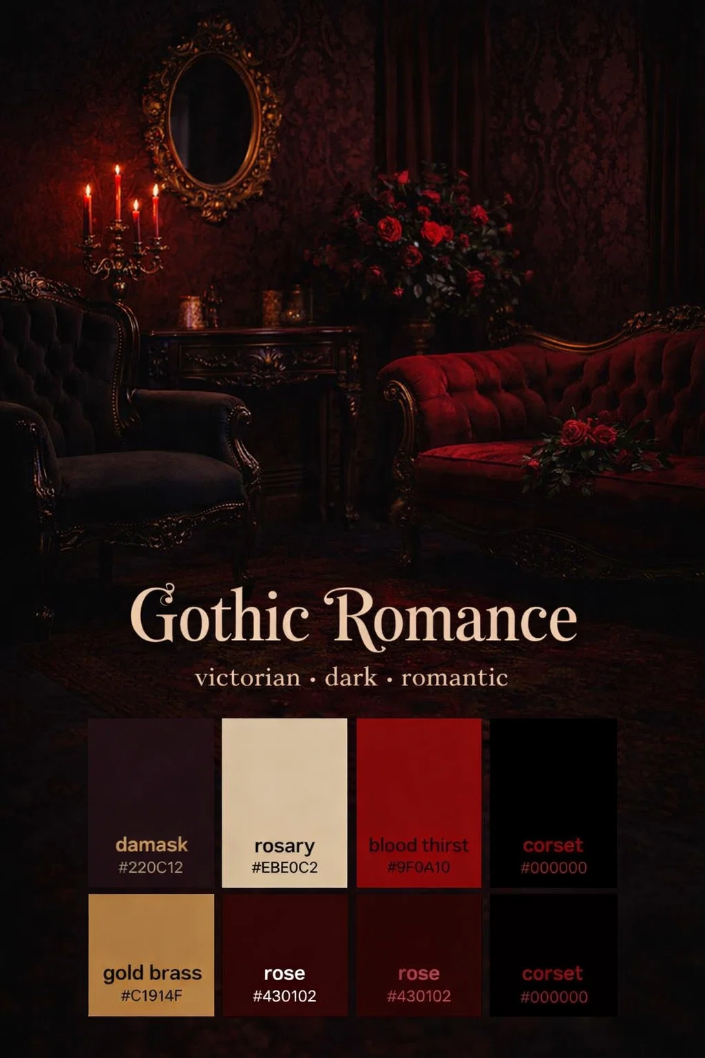
The “Gothic Romance” palette is a carefully curated selection of six hues that balance deep, dark tones with elegant light and warm metallics. It channels the spirit of 19th-century romanticism, where passion, drama, and the sublime were paramount, filtering it through a modern, sophisticated lens. It is not just about dark colors; it’s about the contrast between light and shadow, the tension between warmth and cold, that makes this palette so incredibly compelling.
A Foundation of Mystery: Damask and Rose
At the heart of any gothic aesthetic is a profound respect for deep, rich tones that create atmosphere and depth. The Gothic Romance palette provides this with two incredible foundation colors:
- Damask (#220C12): The darkest color in the set, Damask is a deep, near-black red with a subtle hint of warmth. Named for the complex, reversible patterned fabric often found in luxurious interiors, this color immediately communicates power, history, and a touch of melancholy. It provides an exceptional background that makes lighter colors truly pop and gives any design instant gravitational weight.
- Rose (#430102): A slightly lighter but much warmer companion, Rose is a classic, deep burgundy. Think of dried rose petals or aged red wine. It embodies romance, love, and a controlled passion. Used on its own or layered with Damask, it brings a tactile, velvet-like richness to any surface, making it feel ancient and cared for.
Striking the Balance: Rosary and Gold Brass
The magic of the Gothic Romance palette lies in its ability to avoid feeling oppressive, thanks to the expert placement of lighter and warmer tones. This essential balance prevents the darker hues from overwhelming the viewer and instead makes them feel curated and deliberate.
- Rosary (#EBE0C2): A soft, creamy parchment or ivory hue, Rosary is the designated highlight color of this palette. It provides a clean and elegant break from the deeper tones, offering a visual rest and ensuring high-class contrast. This color perfectly mimics aged paper or a vintage lace, adding an air of fragility and reverence that ties into the “Rosary” name.
- Gold Brass (#C1914F): To add warmth and unparalleled luxury, the palette includes Gold Brass. This is not a bright, shiny gold but rather an aged, deep gold with a slightly tarnished patina. It brings a necessary touch of opulence and history, evoking thoughts of antique candelabras, ornate picture frames, or old jewelry. It’s the color of enduring wealth and craftsmanship.
Adding Intensity: Blood Thirst and Corset
To prevent the palette from feeling too safe, the creators have included two high-intensity colors that add a powerful visual punch and narrative depth.
- Blood Thirst (#9F0A10): A vibrant, saturated red, Blood Thirst is the color of raw passion, urgency, and undeniable danger. In a sea of deeper burgundies, this color demands attention. It is excellent for accents, buttons, or critical warnings, adding an electric current of energy to the entire composition.
- Corset (#000000): The foundation of true darkness. Corset is a pure, unapologetic black. While Damask has a red undertone, Corset is neutral and absolute. It provides the ultimate shadow, making other colors seem lighter by comparison and anchoring the entire palette with a definitive boundary. It represents control, formality, and the deepest night.
How to Apply This Palette in Modern Design
While the colors are steeped in history, their application can be brilliantly modern. You don’t have to be designing a vampire-themed website to utilize this palette; its core principles of dramatic contrast and rich tone can be applied across many different industries and mediums.
Interior Design and Decor
For an interior designer, this palette offers a blueprint for creating incredibly sophisticated and cozy spaces.
- Walls and Textiles: Consider using Damask for an accent wall to create a dramatic, library-like feel. In a living room, velvet curtains in Rose would add texture and warmth. Upholster a large piece of furniture, like a sofa or chaise lounge, in a deep black to anchor the room.
- Lighting and Accents: Use Gold Brass fixtures, lamps, and picture frames to make the room feel alive and well-traveled. Rosary can be used for bedding, lampshades, or area rugs to prevent the space from feeling too heavy and to reflect light beautifully.
- The Punch: Add a small, powerful accent with Blood Thirst. This could be a throw blanket, a single decorative vase, or a piece of modern art that breaks up the monochromatic deep tones and draws the eye.
Web Design and Digital Branding
The high contrast and rich storytelling potential make this palette perfect for specific types of web-based projects.
- Niche Blogs and E-commerce: For a luxury brand selling products like aged leather goods, vintage jewelry, high-end perfume, or even historical fiction, this palette sets a tone of quality and history. A book review blog focusing on mysteries or historical romance could utilize these colors to immediately communicate its genre.
- UX/UI Strategy: Use Rosary as the main text color on a Damask background for incredible readability and a luxurious feel. Use Gold Brass for hyperlinks or interactive elements to make them feel special. Blood Thirst should be reserved for your primary Call to Action (CTA) buttons, compelling the user to click.
- Visual Storytelling: Apply these colors to your brand illustrations or product photography style to ensure that all elements of your digital presence are unified and tell the same dark, romantic story.
Creating Depth with Textures
A color palette is only as good as the surfaces it’s on. To maximize the “Gothic Romance” feel, the colors should be paired with tactile, rich textures that catch and absorb light.
- Velvet and Silk: Nothing captures deep burgundies and dark reds like rich velvet. The soft, reflective surface makes colors like Rose feel even more luxurious. Pair it with smooth, sleek silk in Rosary for a contrast that is irresistible to the touch.
- Worn Wood and Metal: The deep black and damask colors look incredible on distressed wood finishes. The aged Gold Brass should be applied to actual metallic surfaces with a slight patina, not just a flat print, to create an authentic feel.
- Aged Paper and Lace: Use the Rosary color on textured, cream paper for invitations or stationary. Add delicate lace details to recall the historical, intricate side of the Gothic aesthetic.
Avoiding Cliché: Using Gothic Romance tastefully
The challenge with a theme like “Gothic Romance” is avoiding a cheesy or clichéd look. The goal is sophistication, not a Halloween store.
- Subtlety is Key: You don’t need to put a raven on every page. Let the colors do the work. The combination of Damask, Rosary, and Gold Brass is the theme. Adding too many literal symbols will make it look juvenile.
- Embrace Minimalism: Paradoxically, this maximalist palette works incredibly well with a minimalist layout. The colors are so rich and intense that they don’t require complex patterns or cluttered design to be effective. A simple, bold layout allows each color to be fully appreciated.
- Quality Counts: When using these colors, invest in quality materials or high-resolution graphics. A cheap fabric in a deep burgundy will look terrible, while a high-quality velvet will look spectacular. Your execution must match the palette’s inherent sense of value and history.
The Lasting Power of Gothic Romanticism
The popularity of the Gothic Romance aesthetic is not a fad; it’s an enduring current in popular culture, from literature like Jane Eyre to modern dark fantasy. It appeals to a deep human desire for drama, history, and a touch of the beautiful macabre. By mastering this color palette, you are tapping into a design language that resonates with people on an emotional and historical level. So, go forth and create something beautiful, dark, and utterly memorable. The shadows await your touch.
The “Gothic Romance” background collection offers a perfect opportunity for designers to embrace a richer, more evocative color story. Use these colors to create spaces, brands, and digital worlds that don’t just look great but tell a compelling narrative of love, loss, and enduring mystery. We can’t wait to see what you create.