Color has a profound impact on how we perceive the world around us. In the realm of interior design, branding, and digital art, finding the perfect harmony between deep, moody tones and warm, organic neutrals can elevate a project from ordinary to extraordinary. This specific palette, inspired by the intricate veins of a leaf under shifting light, offers a sophisticated roadmap for anyone looking to create a space or a brand that feels both grounded and ethereal.
The Psychology of the Deep Blue and Earthy Tones
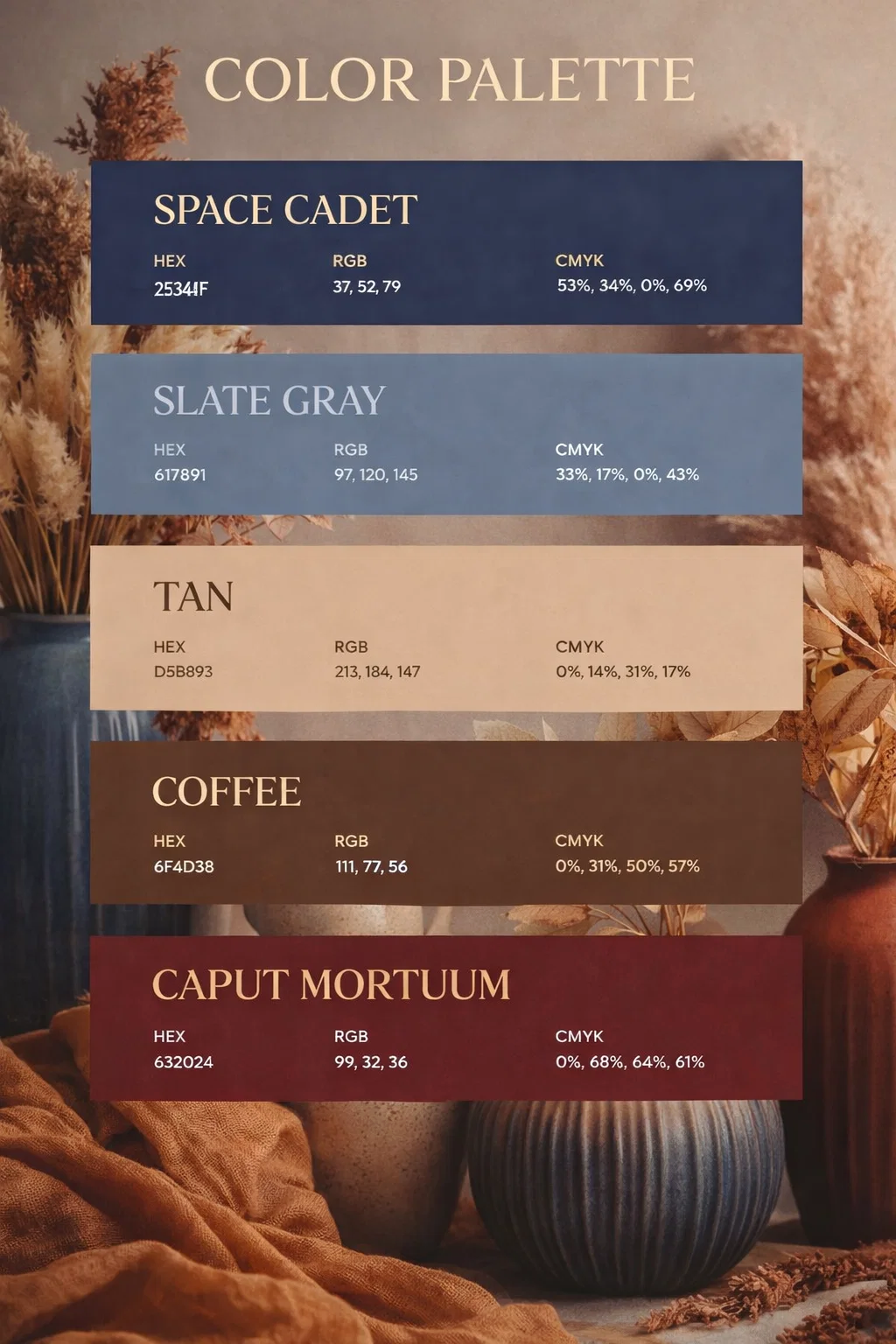
When we look at the combination of colors like Space Cadet and Caput Mortuum, we are tapping into a specific psychological frequency. Deep blues are traditionally associated with intelligence, stability, and the vastness of the midnight sky. It is a color that commands respect without being aggressive. When paired with earthy browns like Coffee and Tan, the coolness of the blue is immediately softened. This creates a sense of reliability and comfort, reminiscent of a quiet library or a misty forest floor in autumn.
Using these colors together suggests a personality that is thoughtful and sophisticated. It is for the person who appreciates the finer details in nature and wants their surroundings to reflect a sense of depth and history. This palette does not just fill a room; it tells a story of organic growth and timeless elegance.
Detailed Breakdown of the Color Palette
To truly understand how to implement these colors, we must look at the specific values and what they bring to the table. Each of these five shades plays a vital role in balancing the overall aesthetic.
Space Cadet: The Foundation of Depth
Space Cadet is a rich, dark navy that serves as the anchor of this collection. With its low light reflectance, it creates a sense of infinite space. In a home, this might be used for an accent wall or custom cabinetry to provide a dramatic backdrop for lighter furniture. In digital design, it is an excellent alternative to pure black, offering a softer yet equally professional feel.
Slate Gray: The Soft Transition
Slate Gray acts as the bridge between the deep navy and the warmer neutrals. It has a slight blue undertone that keeps the palette cohesive. This is a versatile mid-tone that works beautifully for larger surfaces like sofas, rugs, or secondary branding elements. It provides visual relief, ensuring that the transition from dark to light is not too jarring for the eye.
Tan: The Touch of Light
Every moody palette needs a highlight to prevent it from feeling heavy or claustrophobic. Tan provides that necessary warmth. It mimics the look of natural linen, light oak, or sun-drenched sand. This color brings a sense of breathability and brightness, making the darker shades pop and giving the overall composition a modern, airy feel.
Coffee: The Organic Grounding
Coffee is a medium-brown that brings the essence of the outdoors inside. It represents wood, soil, and leather. Using this shade adds a layer of texture and “lived-in” comfort to the design. It is the perfect color for accents like wooden frames, ceramic pottery, or leather upholstery, grounding the more ethereal blues in a tangible, earthy reality.
Caput Mortuum: The Soulful Accent
Perhaps the most unique color in this set is Caput Mortuum. This deep, reddish-brown, historically known as “mummy brown,” adds a touch of mystery and antique charm. It is a complex color that changes depending on the lighting, sometimes appearing more purple and other times more like dried clay. It provides a focal point that is both rich and unexpected.
Incorporating the Palette into Interior Design
Applying this color scheme to a physical space requires a careful balance of light and texture. Because the palette leans toward the darker end of the spectrum, it is ideal for rooms meant for relaxation or focused work, such as bedrooms, dens, or home offices.
Creating a Moody Master Bedroom
Imagine a bedroom where the walls are painted in the deep Space Cadet blue. To keep the room from feeling too dark, you can use Tan for the bedding and curtains. This contrast creates a crisp, clean look that still feels cozy. Slate Gray can be introduced through a plush area rug, while Coffee-toned wooden nightstands provide a sturdy, natural element. Finally, add Caput Mortuum through velvet throw pillows or a piece of abstract art to give the room a high-end, curated feel.
Designing a Sophisticated Home Office
For a workspace, you want a balance between calm and focus. Use Slate Gray as the primary wall color to keep the environment neutral and steady. Incorporate Space Cadet through shelving units or a statement desk chair. Use Tan for desk accessories and Coffee for the flooring or a large wooden desk. This combination promotes a sense of professional stability while the organic tones keep the environment from feeling sterile or cold.
The Power of Texture in a Dark Palette
When working with deep colors, texture is your best friend. Without varied textures, dark colors can sometimes look flat or uninviting. By mixing different materials, you allow light to hit the surfaces in various ways, bringing the colors to life.
- Velvet and Silk: Use these for colors like Space Cadet or Caput Mortuum to highlight their richness and depth.
- Raw Wood and Jute: These materials naturally embody the Coffee and Tan shades, adding a tactile, organic quality to the design.
- Matte Metals: Brushed brass or matte black hardware can complement this palette perfectly, adding a contemporary edge.
- Linen: A Tan linen sofa or curtain set adds a layer of softness that balances the weight of the darker hues.
Applications in Digital Branding and Graphic Design
This palette is not just for physical spaces; it is incredibly effective for digital creators and brands. If you are building a brand that wants to communicate trust, wisdom, and a connection to nature, these colors are an excellent choice.
Space Cadet makes for a strong, authoritative logo color or header background. Slate Gray is perfect for body text or secondary icons, providing high readability without the harshness of black on white. Tan can be used for call-to-action buttons or highlights, drawing the eye naturally to important information. Coffee and Caput Mortuum work well as accent colors for photography overlays or border details, giving the brand a cohesive and professional appearance across all platforms.
Lighting Considerations
Lighting will significantly change how these colors appear. In a room with plenty of natural sunlight, the Tan and Slate Gray will shine, making the space feel more energetic. In the evening, under warm artificial light, the Space Cadet and Coffee tones will deepen, creating a cozy, cocoon-like atmosphere. When choosing these colors, always test them in the specific lighting conditions of your project to see how the undertones react throughout the day.
Conclusion: Finding Your Personal Balance
The beauty of this nature-inspired palette lies in its versatility. While it inherently leans toward a moody and sophisticated aesthetic, the proportions in which you use these colors can completely change the vibe. You might choose to let the light Tan and Slate Gray lead for a more minimalist look, or lean heavily into the Space Cadet and Caput Mortuum for a bold, dramatic statement.
By drawing inspiration from the intricate details of the natural world, such as the veins of a leaf or the shadows of a forest, you ensure that your design feels timeless. These colors have existed together in nature long before they were captured in a digital palette, and that inherent harmony is what makes them so pleasing to the human eye. Whether you are painting a room, designing a website, or creating a piece of art, this combination of deep blues and earthy neutrals provides a rich foundation for creativity and expression.