Finding the perfect color combination can be one of the most exciting yet challenging parts of any creative project. Whether you are redecorating your living room, developing a brand identity, or planning a wedding, the colors you choose set the tone and emotion. Today, we are deep diving into a color palette that is making a huge impact on the design world. It’s a beautifully balanced collection that centers around a foundational Navy but branches out into a symphony of supporting shades. This isn’t just a list of hex codes. It is a guide to creating a complete visual experience that feels both grounded and incredibly sophisticated.
At first glance, this palette exudes a sense of serene confidence. The core colors, including the specific Navy, Teal, and Sky Blue, create a cool and calming flow. The introduction of Beige adds a crucial touch of warmth and texture, preventing the scheme from feeling too sterile or ‘one-note,’ and the inclusion of a perfect White ensures every element pops with crisp clarity. This is a versatile and timeless selection that can adapt to modern minimalist spaces or luxurious, layered designs.
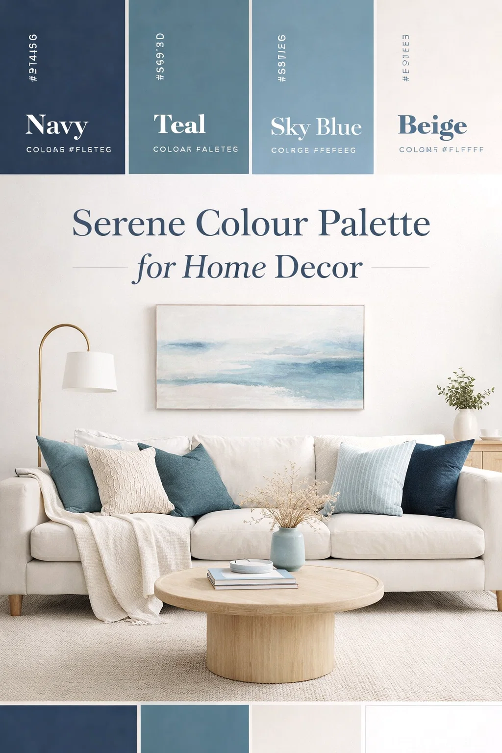
Deconstructing the Palette: Meet Your Core Colors
To truly understand how to use these colors, we need to meet them one by one and appreciate what each brings to the table. Let’s break down the six pillars of this stunning design scheme.
Navy (#2F4156): The Foundational Strength
This is not your average navy blue. It’s a deep, rich shade with a slightly muted quality, preventing it from being overly saturated or primary. In design psychology, navy is a powerful color representing reliability, trust, and professional elegance. Think of it as your primary neutral for this palette. It’s the color of a stormy ocean or a sophisticated suit. When using this palette, view Navy as your anchor. It can handle large surfaces, like an accent wall or major pieces of furniture, and will make every other color it touches feel more deliberate and refined.
Teal (#567C8D): The Sophisticated Bridge
This shade of teal is a beautiful hybrid, leaning heavily towards a muted, dusty quality. It effectively bridges the gap between the dark depth of the Navy and the lighter blue tones. Instead of a vibrant, bright tropical teal, this is a more restrained and intellectual version. It brings a touch of creativity and uniqueness without overpowering the other elements. Teal adds a subtle pop of color and unexpected personality, making it perfect for textiles, artistic accents, or intermediate branding elements.
Sky Blue (#C8D9E6): The Airy Atmosphere
Every grounded color scheme needs a moment to breathe, and that is exactly what this Sky Blue provides. It is an ethereal, incredibly light blue that introduces a feeling of openness and tranquility. This is the color of a clear morning sky or a delicate watercolor wash. In interiors, it can expand a space and create a serene ambiance. In graphic design, it adds cleanliness and easy readability. Use Sky Blue to provide contrast and a sense of fresh air against the deeper colors.
Beige (#F5EFEB): The Essential Warmth
This is perhaps the most critical color in the entire palette for creating balance. It’s a soft, creamy, non-yellowing beige that adds much-needed texture and warmth. In a scheme dominated by cool blues, this beige prevents the entire look from becoming cold. It provides an organic, tactile feel. Think of unbleached linen or polished travertine. Beige acts as a soft counterpoint, making the blues feel more inviting and the overall design more approachable.
White (#FFFFFF): The Crisp Clarifier
Never underestimate the power of a perfect, clean white. This is not a cream or an off-white, but a bright, clear White. Its purpose here is to act as the ultimate contrast agent. It makes every other color look its best. White keeps the palette crisp, clean, and modern. It prevents the other colors from muddying into one another and is essential for maintaining a high-end, professional feel. White is critical for typography, background space, and highlighting detail.
Bringing the Palette to Life in Interior Design
This collection of colors is a dream come true for interior decorators. It balances the best of cozy comfort with modern sophistication. Here are several ways to apply this palette to transform a home.
Modern Coastal: A Relaxed Retreat
The immediate association for this color scheme is often coastal, and for good reason. It’s a perfect fit. Instead of a bright, gimmicky beach look, this palette enables a more mature, ‘Modern Coastal’ aesthetic. Use the Navy for an oversized, comfortable sofa. Layer it with pillows in Teal and Sky Blue. For the walls, choose a very light Beige or Sky Blue to keep the space feeling open. Introduce White through cabinetry, trim, and large-scale art frames. To add a tactile element, incorporate natural fibers like a jute rug, which picks up the warm tones of the Beige. This combination is all about sophisticated relaxation.
A Stately and Productive Home Office
This palette thrives in environments that require focus. Design a professional and stimulating home office by making Navy the main event. An accent wall behind your desk, or even full built-in shelving painted in this shade, creates a powerful, executive backdrop. Use the Teal on an upholstered office chair or small decorative objects. Sky Blue works wonderfully as a ceiling color or for lighter wall space to keep the room from feeling too dark. White trim and furniture provide sharp, clean lines that enhance productivity. The Beige can be introduced through an area rug or a set of linen curtains, adding warmth and preventing the space from feeling clinical.
A Luxurious and Serene Bedroom Sanctuary
Transform your bedroom into a peaceful oasis using these calming cool tones. Use the Beige as your main wall color for a soft, tactile, and warm atmosphere. Bring in the cool drama through an upholstered velvet headboard in Navy. Dress the bed with crisp White linens, layered with a comforting duvet or throw blanket in Sky Blue. Add the Teal through textured lampshades or a piece of art that incorporates both Navy and Teal. This blend ensures your bedroom feels both cozy and incredibly high-end, perfect for unwinding.
Applying the Palette to Brand Identity and Graphic Design
For designers and business owners, this color combination is a versatile and reliable tool. It is particularly effective for industries that need to communicate stability, intelligence, and modern innovation simultaneously.
Corporate Trust and Intelligence
For financial services, tech startups, or law firms, Navy and White form a powerful foundational brand voice. It speaks to history, stability, and intelligence. The Teal can be used as a primary accent color for logos, buttons, and call-to-actions, introducing a modern and forward-thinking edge. Use the Sky Blue and Beige for backgrounds on website sections, creating a clean user experience that feels approachable and fresh. This mix makes a brand feel both established and open to innovation.
Wellness and Creative Agencies
A branding project for a yoga studio, wellness brand, or a creative design agency requires a different kind of sophistication. Here, you might shift the weight, using Beige and Sky Blue as the dominant backdrop to create a feeling of openness, calm, and approachability. The Navy and Teal then become the stronger accent colors for logos and headers, adding definitions of strength and creative flair. This blend creates a trustworthy and inspired image, suggesting a brand that is both centered and innovative.
Translating the Palette to Event Planning and Weddings
Weddings and special events can utilize this palette to create a memorable and stylish atmosphere that is both classic and unique. This isn’t just a standard ‘blue and white’ wedding.
Sophisticated Nautical Elegance
For a summer waterfront wedding, this is the ultimate elegant approach. Ditch the bright anchors and use Navy for your bridal party attire (bridesmaids or groomsmen suits) for a chic, clean line. Use Teal and Sky Blue as accent colors in floral arrangements, which are balanced with plenty of crisp White and greenery. The Beige can be introduced through table linens, giving the entire event an organic, warm foundation against the cool blues. This creates a refined, stylish nautical feel.
A Cosy and Luxurious Winter Celebration
This palette also works beautifully for a refined winter event. The Navy provides a deep, moody base, while the Sky Blue and White mimic the crisp, fresh feeling of a snowy day. Incorporate the Beige and Teal through velvet textures (table runners or napkins) and warm candlelight to create a cozy, luxurious glow. This approach turns the cool tones into a sophisticated and inviting winter wonderland.
Pro Design Tips for Mastering the Mix
Now that you have the hex codes and some application ideas, let’s talk about strategy. Getting the proportions right is key to making any color palette successful.
The 60-30-10 Rule
This is a classic design principle that will save you from visual clutter. When using these six colors, decide which will be your primary, secondary, and accent colors. For example, in an interior, you might use Beige for 60% of the room (walls and rug), Navy for 30% (sofa and accent wall), and the Teal, Sky Blue, and White as the remaining 10% (pillows, art, decor). Keeping this balance prevents the palette from feeling competitive or chaotic.
Varying Texture is Non-Negotiable
Color is only one part of the equation. Texture brings color to life. For this specific palette, which can be quite cool, varying textures is critical to creating depth and warmth. Imagine a flat painted Navy wall versus a textured Navy grasscloth wall. Consider a flat cotton Beige pillow versus a chunky knit Beige throw. Mixing finishes, such as a matte Navy with a slightly glossy Teal ceramic vase, adds necessary dimension and sophisticated layers.
Pay Attention to Lighting
Lighting changes everything. A Navy wall will look completely different in a dark room with warm artificial light than it will in a room with large windows receiving direct sunlight. Before you commit to paint or expensive textiles, always get large swatches. Look at them in your specific space at different times of the day (morning light, direct noon sun, and under your lamps at night). Your lighting might make the Teal look greener, or the Sky Blue look almost white, so testing is crucial for ensuring you get the result you envision.
Final Thoughts on this Versatile Collection
This Navy, Teal, and Sky Blue palette, supported by Beige and White, is far more than a simple color combination. It is a carefully curated tool that allows for incredible design versatility. Whether you are aiming for a relaxed Modern Coastal living room, a professional corporate website, or a sophisticated wedding celebration, this palette provides the exact balance of grounded strength, creative pops, and inviting warmth needed to succeed. Embrace these colors as your creative foundation and have fun layering, mixing textures, and seeing your design vision come together with effortless elegance.