Color has a profound impact on our emotions, our homes, and our creative projects. When we look at a palette that combines the fiery depth of rust with the soothing whispers of sage and fern green, we are not just looking at paint swatches. We are looking at a story of nature, transition, and balance. This specific combination, often referred to as an earthy or organic palette, has taken the design world by storm, offering a sophisticated alternative to the sterile minimalism that dominated the last decade. It evokes a sense of groundedness, warmth, and timelessness that works beautifully across various mediums, from interior design to branding and wedding planning.
The Psychology of Earthy Tones
Understanding why this color palette feels so right requires a look into the psychology of the colors involved. Rust and terracotta are derivatives of red and orange, colors known for their energy and warmth. However, because they are tempered with brown and clay undertones, they do not feel aggressive. Instead, they feel inviting and stable. They remind us of the earth beneath our feet, ancient pottery, and the changing leaves of autumn.
On the other side of the spectrum, we have the greens. Sage green and fern green represent growth, renewal, and tranquility. Green is the color our eyes find easiest to process, which is why being surrounded by these shades can lower stress levels and improve focus. By pairing the warmth of rust with the coolness of green, you create a visual harmony that mimics the natural world. This balance is what makes the palette feel so complete and satisfying to the eye.
Breaking Down the Palette
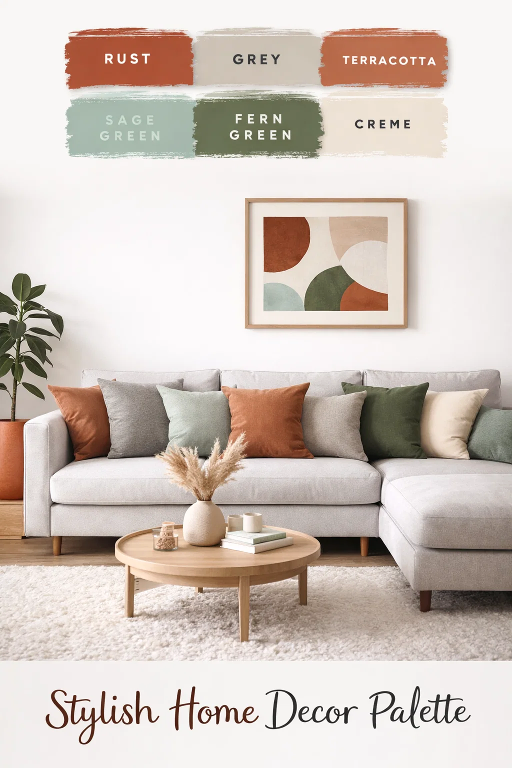
To use these colors effectively, it helps to understand the role each one plays in the overall composition. Each shade in the image serves a specific purpose in building a cohesive aesthetic.
- Rust: The anchor. This is a bold, pigmented shade that provides depth. It acts as a focal point and adds a sense of luxury and heritage.
- Grey: The bridge. This cool, neutral grey prevents the palette from becoming too “muddy.” It provides a clean slate that allows the other colors to shine.
- Terracotta: The transition. Lighter and more orange than rust, terracotta adds a playful, Mediterranean vibe that keeps the energy high.
- Sage Green: The breath of fresh air. This soft, muted green acts almost as a neutral, bringing a lightness that prevents the darker colors from feeling heavy.
- Fern Green: The forest floor. This deep, mossy green provides a beautiful contrast to the rust, leaning into the classic “complementary” relationship on the color wheel.
- Creme: The highlight. Every palette needs a highlight to create contrast. Creme adds warmth and softness without the starkness of pure white.
Transforming Interiors with Rust and Green
If you are looking to refresh your living space, this color story offers a wealth of possibilities. It is particularly effective in rooms where you want to feel relaxed but inspired, such as a living room, bedroom, or a home office. The key to successful interior design with these shades is layering and texture.
Creating a Living Room Sanctuary
In a living room, you might choose to use the darker shades as accents. Imagine a plush, velvet sofa in a deep rust color set against a light grey or creme wall. To balance the warmth of the sofa, you can introduce sage green through throw pillows, blankets, or indoor plants like eucalyptus or olive trees. The fern green can be brought in through artwork or a textured area rug. This creates a space that feels curated and intentional, rather than just “decorated.”
The Moody Bedroom Retreat
For a bedroom, you can go even bolder. A feature wall painted in a matte fern green creates a cocoon like effect that is perfect for sleeping. Pair this with terracotta colored bedding and creme linen curtains to soften the look. The combination is sophisticated and adult, providing a sanctuary that feels miles away from the chaos of daily life. Natural wood furniture pieces, such as oak or walnut, complement these tones perfectly because they share the same organic DNA.
Applying the Palette to Graphic Design and Branding
For designers and entrepreneurs, choosing a brand color palette is one of the most important decisions in the creative process. This rust and green combination is ideal for brands that want to communicate qualities like sustainability, handmade craftsmanship, or holistic wellness. It moves away from the “corporate blue” and “tech white,” instead offering a brand identity that feels human and approachable.
Logo and Website Aesthetic
When designing a logo using these colors, consider using rust for the primary typography to ensure it stands out and remains legible. Use sage green for secondary elements or backgrounds to create a sense of calm. On a website, using creme as a background color instead of white can make the user experience feel more premium and less straining on the eyes. It gives the digital space a tactile, papery feel that aligns with the organic theme.
Social Media Cohesion
If you are a content creator, maintaining a consistent color palette on your Instagram feed or Pinterest boards is essential for building a recognizable brand. Using these six colors as your guide ensures that every photo, graphic, and video feels part of the same story. Whether you are photographing a latte on a terracotta coaster or wearing a sage green sweater in a forest setting, the visual thread remains strong.
Event Planning and Wedding Themes
The “Boho-Chic” wedding trend has made rust and green one of the most requested color combinations for modern couples. It transitions beautifully through the seasons. In the spring and summer, you can lean more heavily into the sage and creme tones. In the autumn and winter, the rust, terracotta, and fern green take center stage to create a cozy, intimate atmosphere.
Floral Arrangements and Decor
Florals are the easiest way to showcase this palette. Dried flowers like pampas grass and bleached ruscus provide the creme and light grey textures. For the pops of color, you can use terracotta roses, rust colored dahlias, and plenty of eucalyptus or ferns for the greenery. Incorporating wood elements, copper accents, and stoneware plates at the reception tables will tie the entire theme together, making the event feel grounded and incredibly stylish.
Tips for Balancing Warm and Cool Tones
While this palette is naturally balanced, it can be easy to lean too far in one direction. If you use too much rust and terracotta, the space or design can feel overly hot or dated. If you use too much green and grey, it might feel a bit cold or sterile. Here are a few quick tips to keep in mind:
- The 60-30-10 Rule: Use a neutral (Creme or Grey) for 60 percent of the space, a secondary color (Sage or Fern Green) for 30 percent, and your boldest color (Rust or Terracotta) for the final 10 percent as an accent.
- Lighting Matters: Warm colors like rust look vibrant in natural sunlight but can look muddy under cool LED lights. Always test your colors in the specific lighting of your environment.
- Texture is Key: Because these are earthy tones, they look best when paired with natural materials. Think linen, wool, clay, wood, and stone. Avoid overly shiny or plastic surfaces, which can clash with the organic vibe.
Incorporating the Palette into Fashion
This color story is not just for houses and websites; it is also a staple in a “capsule wardrobe.” A rust colored trench coat or a pair of terracotta trousers can be the centerpiece of an outfit, while sage green accessories or a creme knit sweater provide the perfect supporting roles. These colors are universally flattering, working well with various skin tones because they mimic the natural hues found in our environment.
Conclusion
The beauty of the rust, terracotta, and green palette lies in its versatility and its ability to connect us to nature. In a world that often feels fast paced and digital, these colors offer a much needed pause. They invite us to slow down, breathe, and appreciate the simple beauty of a clay pot, a forest path, or a sunset. Whether you are painting a room, designing a brand, or planning a milestone celebration, using these earthy tones ensures a result that is both modern and timeless. By embracing this harmony of warmth and coolness, you create more than just a visual display; you create an atmosphere that feels like home.